

I edited all these photos the first 3 are some I took in photography, the other 3 are stock photos. Each photo has 4 things done to them. It was a fun assignment although it was hard to figure out things to do.


I edited all these photos the first 3 are some I took in photography, the other 3 are stock photos. Each photo has 4 things done to them. It was a fun assignment although it was hard to figure out things to do.


I used a ton of filters on the tiger. It was a fun assignment and I enjoyed it a lot. It looks like an amalgamation of random filters, which was exactly what we were doing.

I had a hard time with this one, I messed up and I couldn’t do certain things but I did try and it looks somewhat close to what I was trying to achieve. But other than messing up, it still looks kind of cool. I needed to use a lot of tools and I had to adjust it several times.


I had to make several layers for different things, I also had to adjust things occasionally. The colors were mostly taken from the picture itself. A lot of things were hard to do. The photo popped out of the project more than once so it was kind of hard.

This project, was challenging, as I messed up a whole lot during it. It looked nice once I finished it however. It was a little fun during the process. I did learn how to do a few things I didn’t know how to do before.
The way text is can either make or break an image depending on different styles and the image itself. These are showing the same text and the same image except the font styles are different.
 Those two above used some Oldstyle fonts.
 The two above here used Modern fonts.
 The two above used Slab Serif fonts.
 Above used Sans Serif.
 Above uses Script fonts.
 And lastly, above uses Decorative fonts.
Here is my logo, I did the image by drawing different things on several different layers (it was 8 in total and then I combined some so then it was 6.) Anyway, this represents me because I can be more than one way and I’m not restricted to only cutesy stuff, I can enjoy horror as well etc. I sometimes wear a metaphorical mask to hide some emotions and such. The best part of the logo is the things that go into the logo to make it one whole thing. I could improve on digital art as a whole…. And most definitely the text.


Analogous.
 Complementary.
 Split Complementary.
 Triadic.
 I did these to the point where I would only use the color palette in the drawings and no other colors, I chose the colors slightly randomly but each had their own thing. The color wheels really helped in this, and they’re the reason I have these colors together in the first place.
I threw in random shapes and stuff in it.
Lines. Lines are incorporated into both images and they are part of the design.
Shapes.
![]()
Both use shapes in one way or another, to make a shape out of the shape usually.
Proximity.
 It works more with how close something is to something.
Textures.

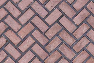
These are most definitely textures considering it looks like you could touch and feel either one.
Value.

The shadows and the light create what is the value in both images.